02 · SOCIAL-FIRST VOICE & VIDEO FOR GAMERS
Hamul
A desktop app for gaming with friends. I designed the infrastructure and the product in parallel, making Hamul feel social-first instead of another Discord clone.
- Daily active users 10k+
- Avg time in party 205 min
- Avg party size 4
- 14-day retention 28%
- Played weekly with friends 96%
- Power-ups used 40M+
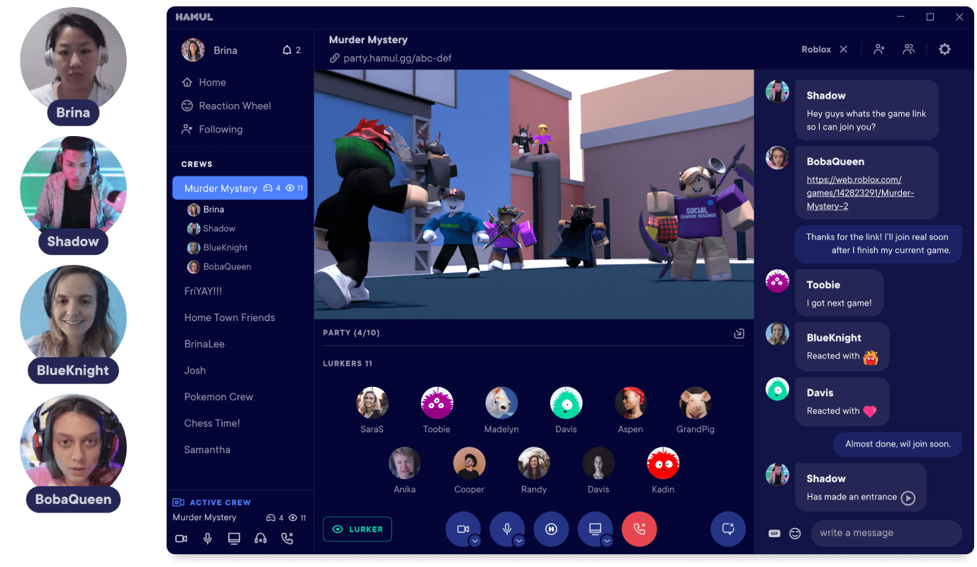
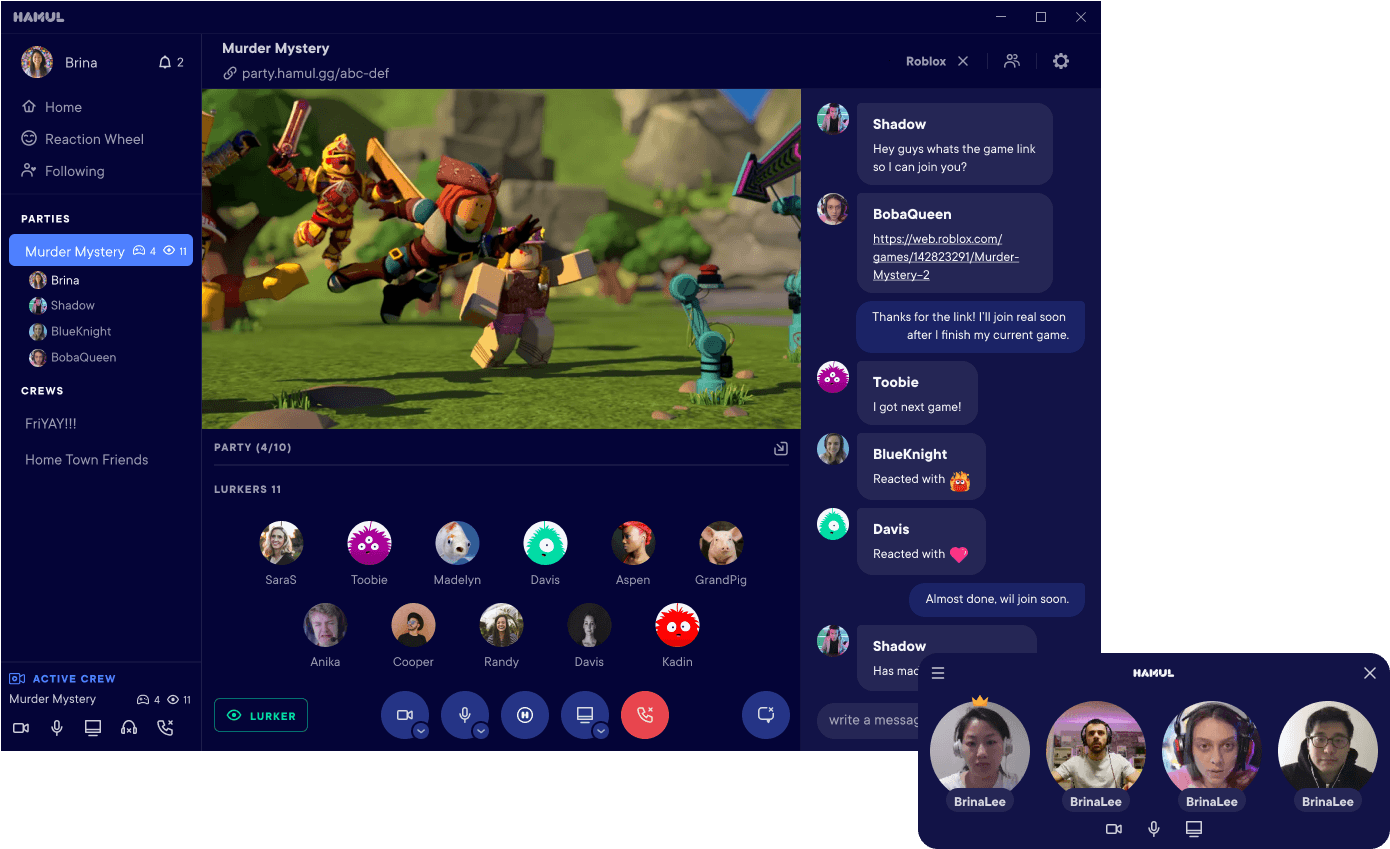
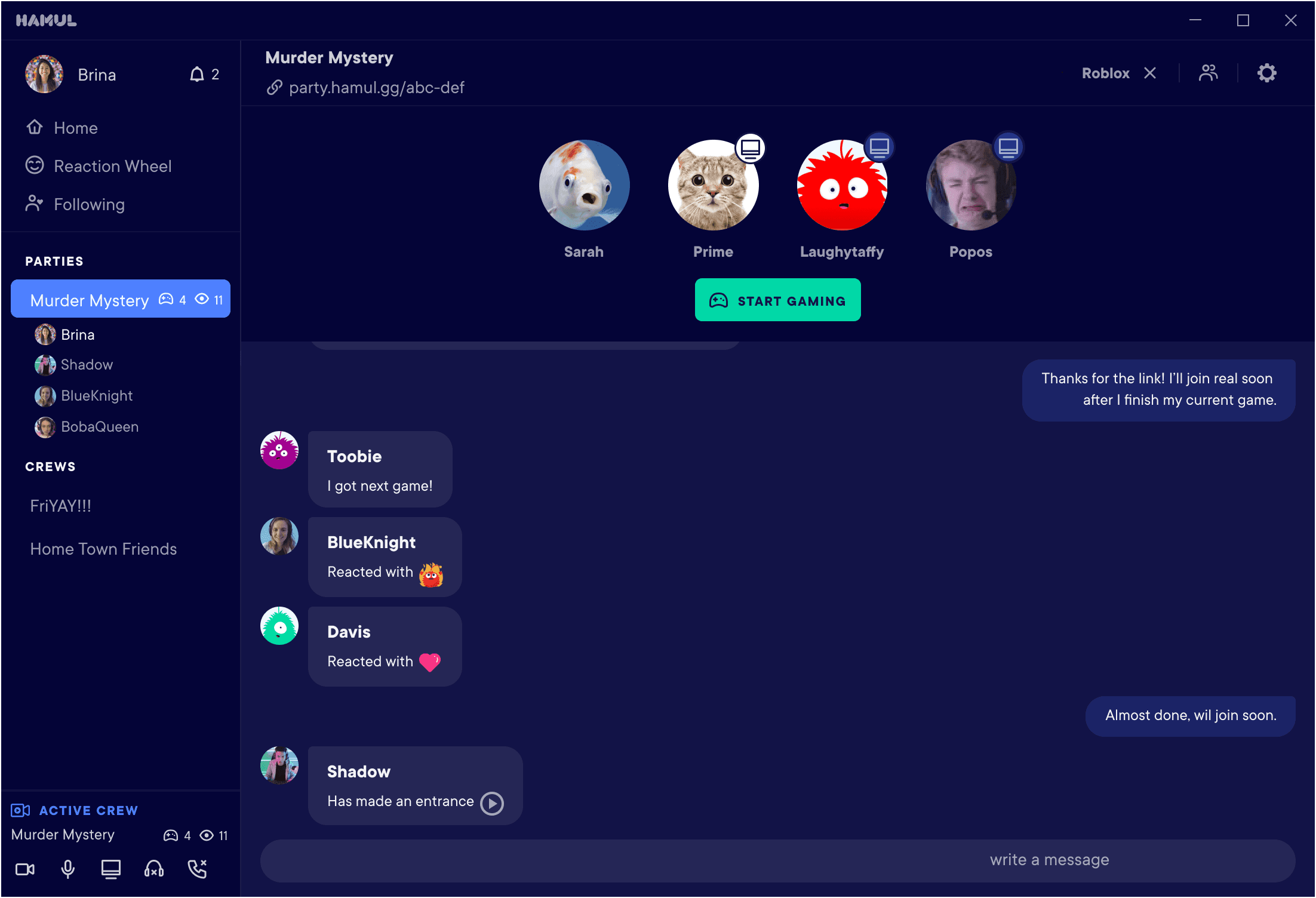
Hamul was a desktop app focused on making gaming with friends feel more social. Players wanted lightweight video, voice, and reactions that worked across games with minimal setup. Hamul became a communication layer for small groups, built around presence and fast coordination.
I owned the product design end to end: strategy, system, motion, and ship. I partnered with PM and engineering as the team built infrastructure underneath me in parallel.
The problem
When I joined, Hamul had the bare minimum for video chat. The job was twofold:
- Raise usability and feature depth to compete in a crowded comms space, and
- Build a distinct identity that made Hamul feel social-first, not like another Discord clone.
We were shipping fast while the foundation was still being built. I had to design the infrastructure and the product in parallel without slowing engineering down.
The discovery
Beyond replication
Copying competitor features wasn’t a strategy. Hamul’s edge was social-first gaming communication. Small interactions that create the feeling of being together, even when you’re not in the same game or even playing at the same time.
That became the north star: design for group dynamics, not just voice and video.
The framework
- Joyful over Formal.
Prioritize creating an environment that fosters joy and laughter over a more formal approach.
- Unique over Incremental.
Deliver unique features that captivate users, over incremental improvements.
- Simplicity over Complexity.
Focus on intuitive user experience over advanced features that complicate interfaces.
- Community over Individual.
Emphasize collaborative community-building experiences over individual journeys.
Research approach
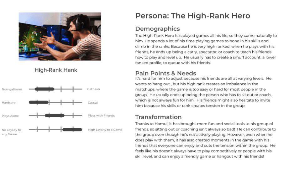
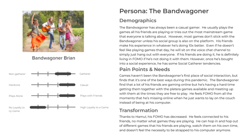
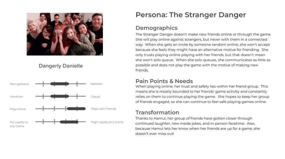
We didn’t have a dedicated UXR team, so I used lightweight research that matched our pace: competitor teardowns, guerrilla testing, and direct observation of users in the product.
One quote kept showing up in different forms:
“Sometimes I just want to hang out. I might be watching YouTube while my friends are playing. I still want to socialize but not play.”
That shaped a key product truth: we weren’t only building for “in-game comms.” We were building for being together while doing your own thing.
Key Bet #1: Make “start a party” the growth engine
The highest-leverage loop was parties. Party creators (producers) triggered the flywheel. A single party created activity for multiple users.
The problem: starting a party was high friction. On PC, getting two people in the same place at the same time is hard. If you don’t successfully form a party, you never experience the product’s value. So I focused on removing uncertainty and making coordination easier.
What shipped
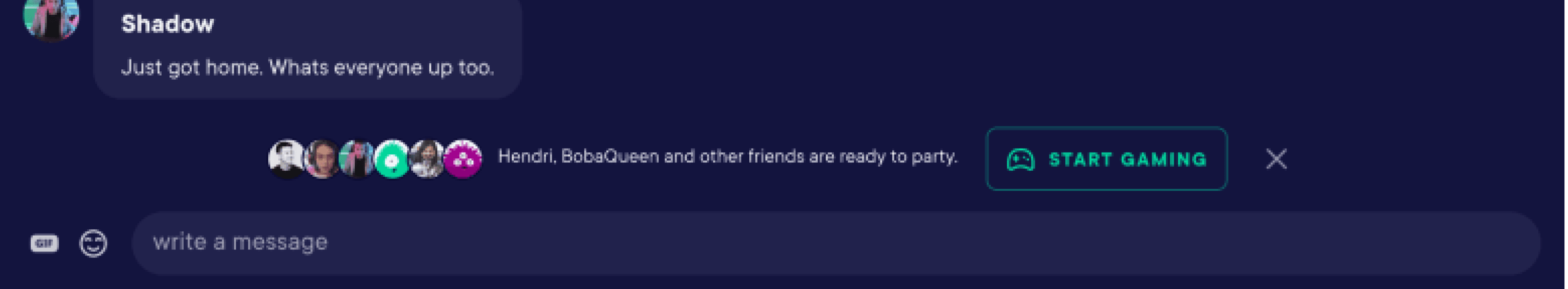
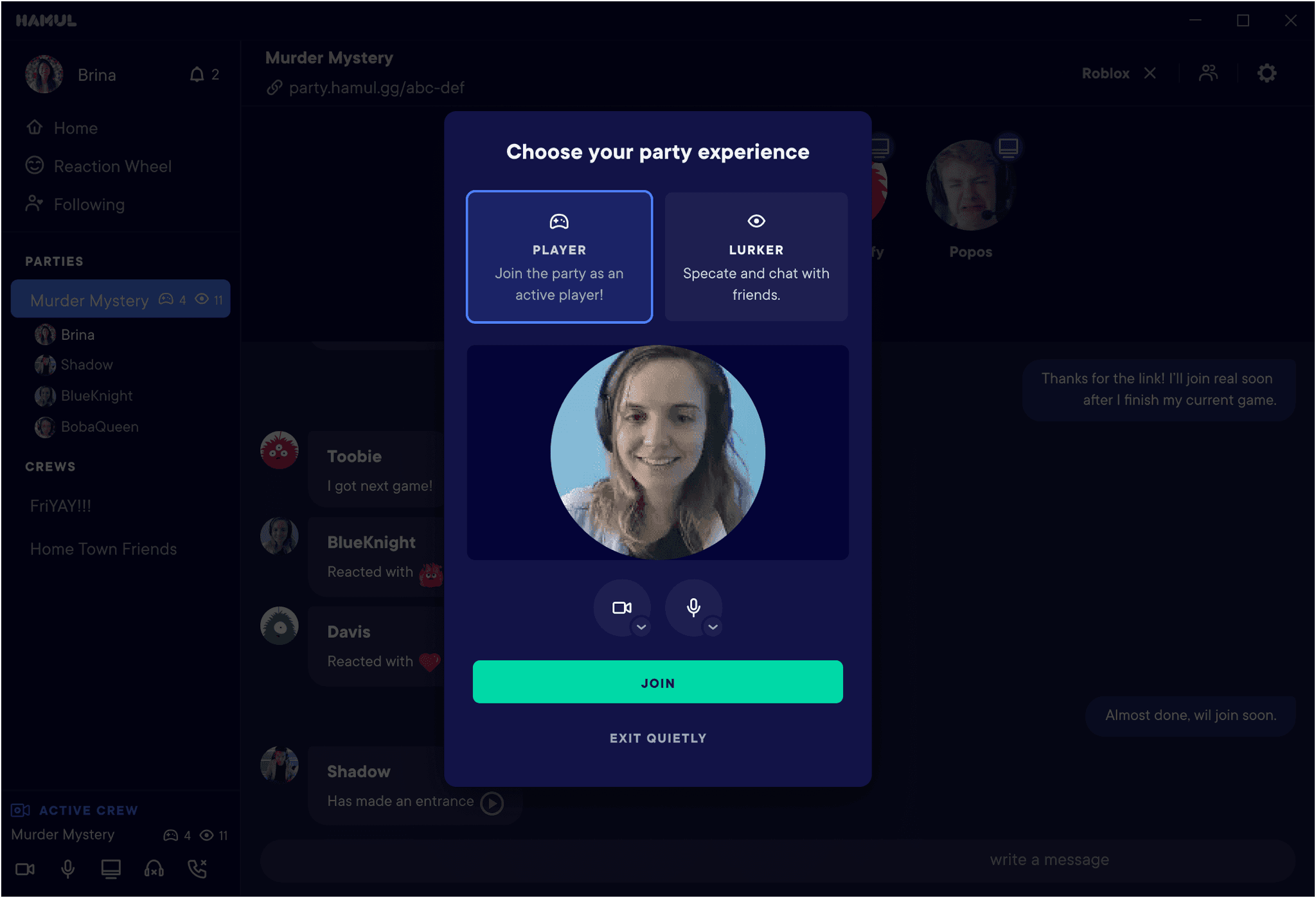
I added online presence inside the chat log, so users could see in real time if someone in the thread was active and ready to join.
Impact
That small change increased Party 2+ DAU conversion by 8% and lifted our funnel conversion from 15% → 23%.
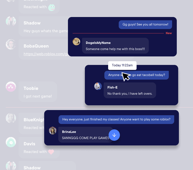
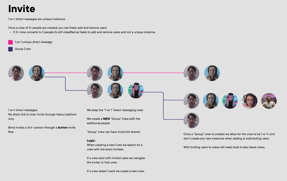
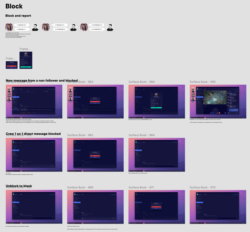
Key Bet #2: Messaging as relationship infrastructure
I built the messaging system from the ground up and set clear goals:
- Public chat should help people meet and coordinate quickly
- Private messaging should support longer-term relationships and repeat play
The tradeoff wasn’t “ephemeral vs saved.” It was discovery vs depth. I prioritized a reliable core messaging UX first, then staged enhancements (links, attachments, GIFs) behind stability and performance work (pagination, navigation, long logs).
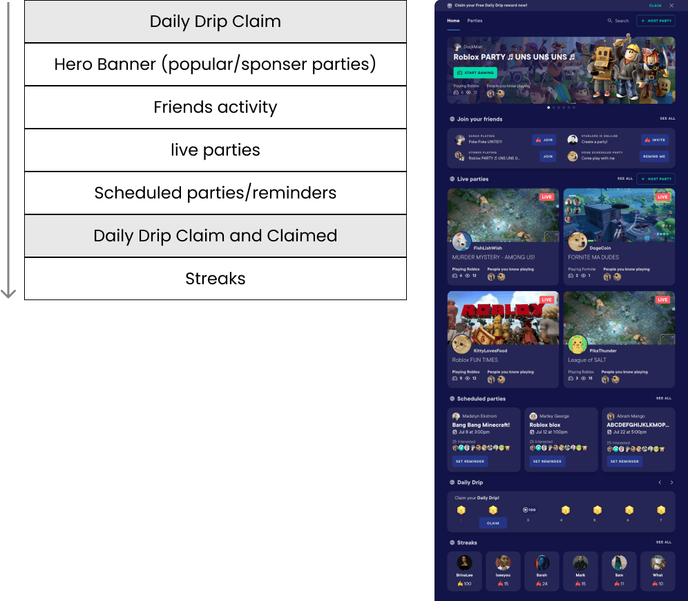
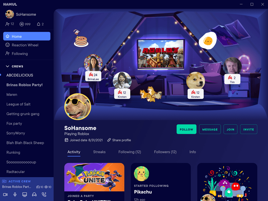
Key Bet #3: Homepage as a retention lever
Party creators drove retention, so the homepage had one job: get users into a party fast.
We aggressively surfaced active and popular parties with clear calls to action. I also designed the homepage to adapt based on a user’s behavior so the most-used actions stayed closest.
One constraint I held firm: the hero area stayed consistent, so the page never felt chaotic even as it adapted.
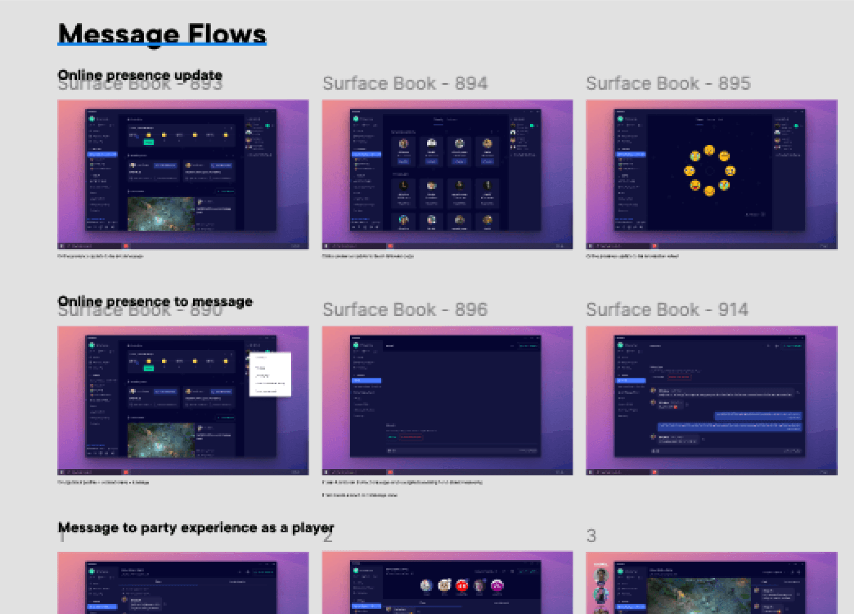
Prototypes
Prototypes were my main alignment tool. They let me validate interaction patterns quickly, move faster than static comps, and reduce ambiguity during engineering handoffs. I used prototypes to communicate the “feel” of the product early, then later to clarify edge cases and complex flows.
The first few months of feedback were brutal. We kept inviting the whole company to test biweekly anyway. Staying open and actually listening, even when it was hard to hear, is what got us through. The room flipped from skepticism to support over a few months.
The execution
The final product pulled presence, parties, messaging, and an adaptive homepage into one place. Social-first, built for gamers.
Impact
Acquired by Roblox in 2022. The app sunset shortly after. The team and the work shipped onward at Roblox scale.
Project learnings
Designing the product and the infrastructure at the same time taught me to stage value, not features. Every iteration had to be honest about what was load-bearing and what could wait. The 8% conversion lift came from a small move (presence in the chat log), not the flashy ones. Proof that the right diagnosis beats the bigger fix every time.